Page Layout Examples
The following examples are some page layout examples and experiments. I have included with them information about the elements of CSS Grid Layout used.
- A simple grid
- A simple responsive grid
- A responsive layout using named Grid Areas
- Two column responsive layout with footer
- Two column responsive layout with footer using Named Grid Lines
- Two column responsive layout with footer using Named Grid Areas
- 16 column flexible grid
- Placing elements into Grid Areas on the 16 column grid
- Skeleton Grid experiments
- AG Grid Example
- Simple Grid + Flexbox example
- Auto Placement Example
- Hero Image Panel
- Listing with thumbnails
- Thumbnails with title
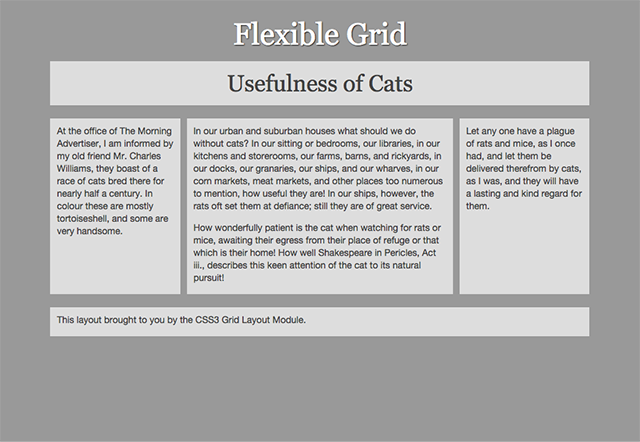
A simple grid
This is a simple, non-responsive layout using the line-based placement properties. I have created a layout that is essentially an old school liquid layout with two fixed width columns and an auto stretching content area.
A simple responsive layout
This is a simple, responsive layout using the line-based placement properties and three breakpoints.
I am using the shorthand grid-row and grid-column properties in this example.
A responsive layout using named Grid Areas
A simple responsive layout with three breakpoints. This time I am using the grid-area to define the named areas of the grid and describing the grid with the grid-template-areas property within the Media Queries.
Two column responsive layout with footer
Two column responsive layout with footer using named grid lines
Two column responsive layout with footer using Named Grid Areas
16 column flexible grid
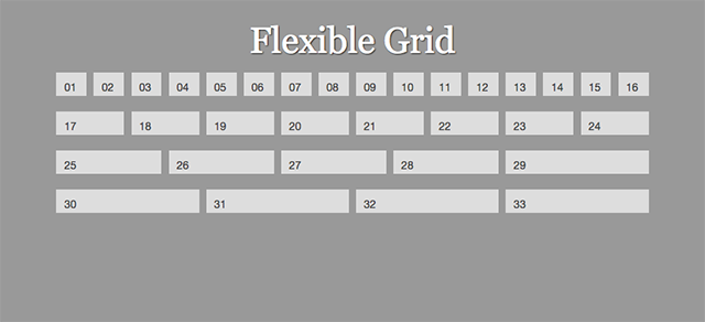
An example demonstrating how Grid can be used to create a flexible multiple column grid. This example uses the repeat keyword and named grid lines.
Placing elements into Grid Areas on the 16 column grid
Creating a simple three column layout by placing items onto our 16 column grid, as an example of how this could be used in practice.
Skeleton Grid Experiments
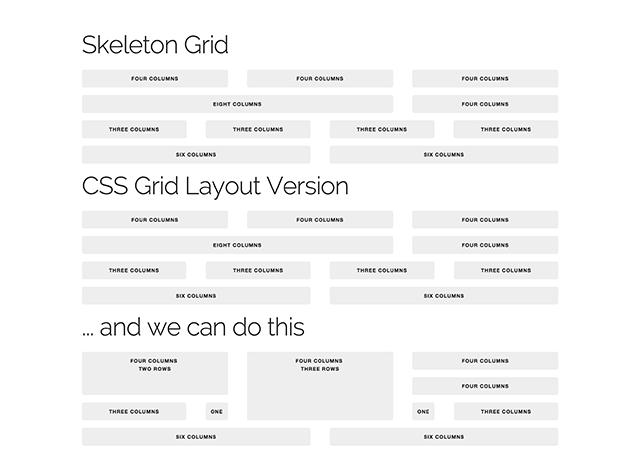
Taking the grid used by the Skeleton framework as an example. Demonstrating how CSS Grid Layout removes the need to describe layout in markup.
Skeleton Grid Layout
Taking the grid used in my Skeleton experiments and using that for a layout.
AG Grid Example
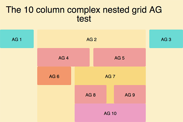
I was interested in whether I could recreate the example used inthis blog post about the Susy Grid System. Susy is a very clever semantic Grid system that relies on pre-processing CSS to calculate your grid.
- I have fixed the row heights just to match the Susy example. In Grid Layout you actually have the benefit of being able to easily have full height columns if you want them.
- This is an example where the lack of subgrid became an issue. The layout is absolutely doable but you can see the problem of fraction widths in the gutters. I’d have liked the nested grids to conform to the main grid.
- It works! Other than the subgrid issue I could create this complex nested grid without any need for a preprocessor, complicated math, or clear fixes.
Simple Grid + Flexbox example
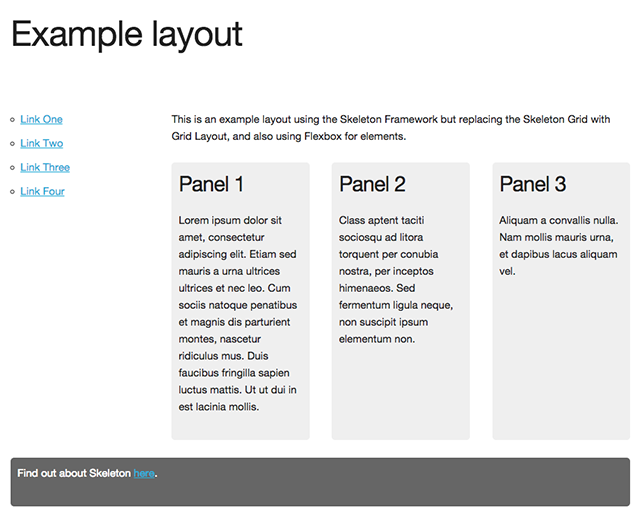
A simple example used in my presentation for the Responsive Web Design Summit, to demonstrate using Grid for the main layout and Flexbox for UI items.
Auto Placement Example
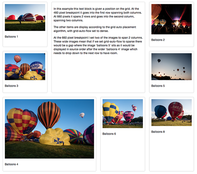
Playing with the Auto Placement algorithm and dense and sparse grid-auto-flow modes.
- The example is responsive, and I redefine the grid at 2 breakpoints after the initial single column grid.
- The list item containing text is actually positioned upon the grid. All other elements are placed using auto-placement.
- There are no gutter columns, spacing is just margins and padding on the elements.
-
Read an in-depth article about how Grid Auto-Placement works from Manuel Rego Casasnovas who is working on the implementation.
- Grid auto-flow
- Grid auto-flow with a positioned element