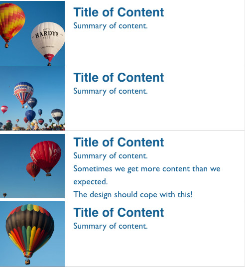
Responsive listing with thumbnails
Taking a starting point of the pattern Brad Frost lists with his responsive patterns http://codepen.io/bradfrost/full/evwgx
The original does not cope so we when content of differing heights is added so I’m using CSS Feature Queries to enhance the pattern.
Flexbox and grid enable the boxes to line up even if we add additional content to any box.
Note that we use Feature Queries in such a way that we start with the version for the most limited of browsers and then build up to those that support grid, making use of the fact that in the CSS Cascade properties and values defined later in the stylesheet override those that come before.
See the Pen List with thumbnails enhanced using grid and flexbox by rachelandrew (@rachelandrew) on CodePen.


