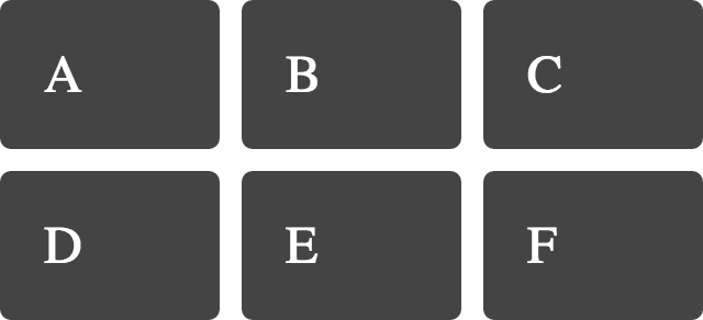
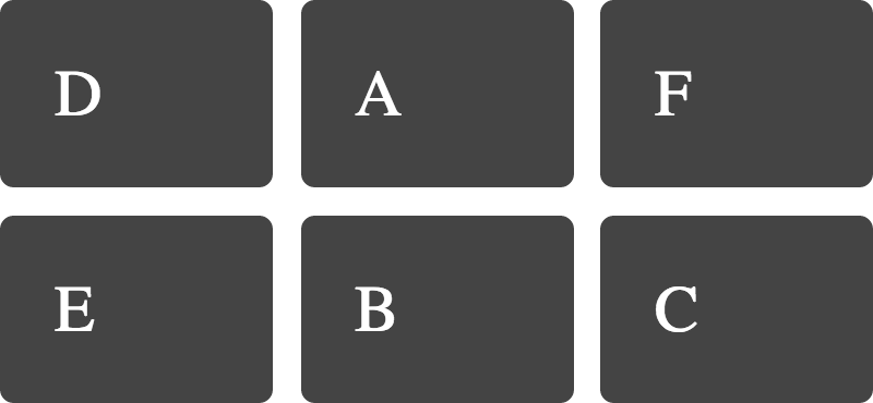
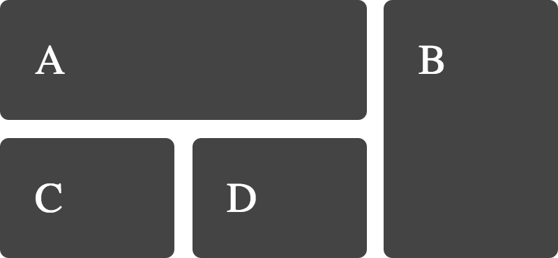
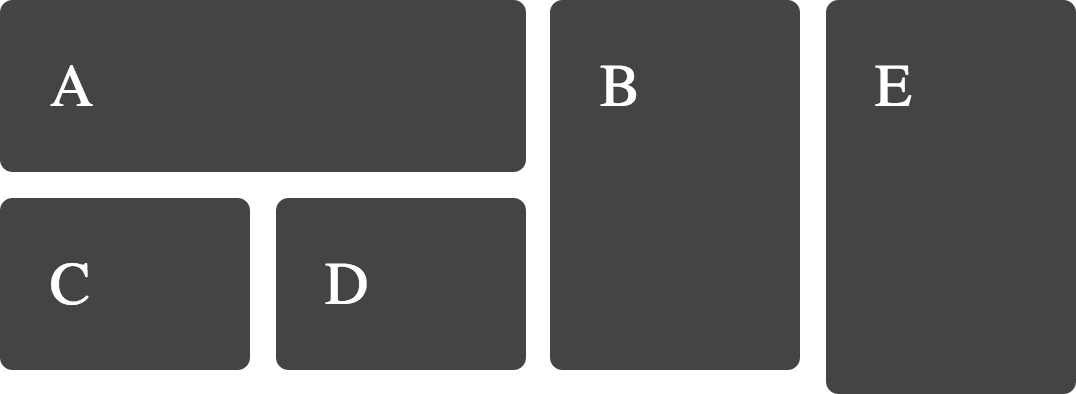
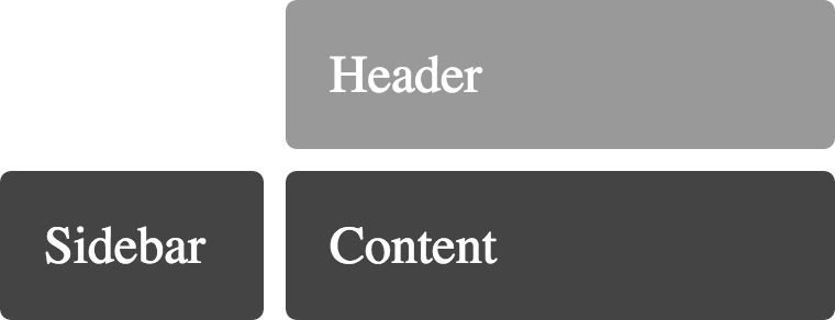
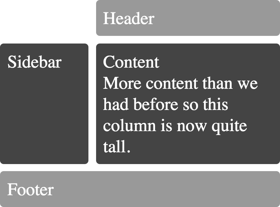
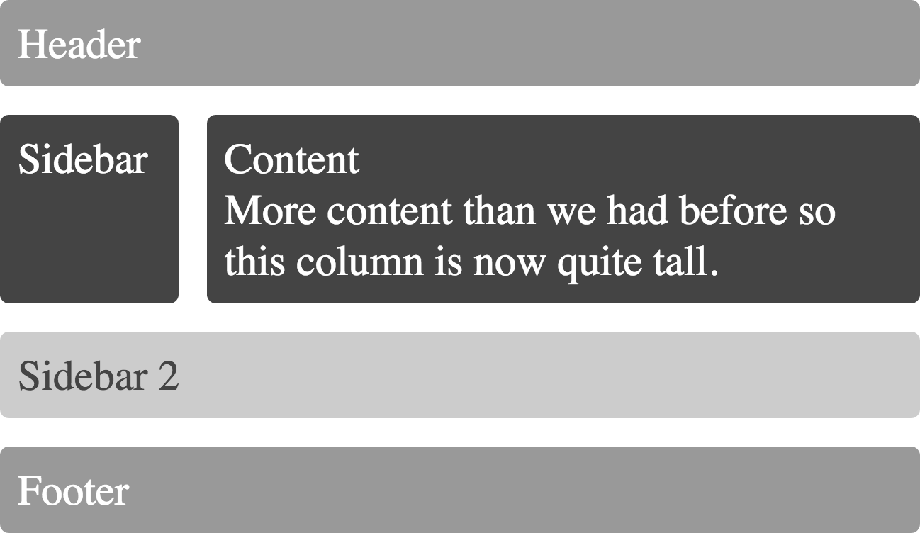
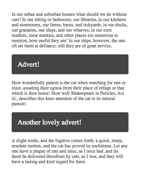
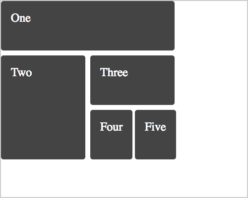
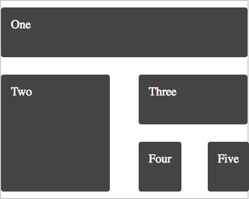
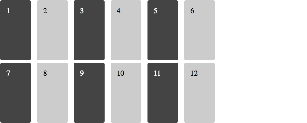
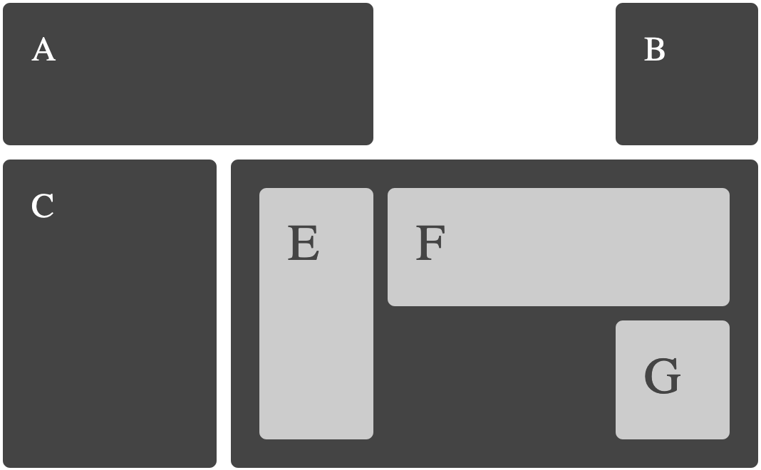
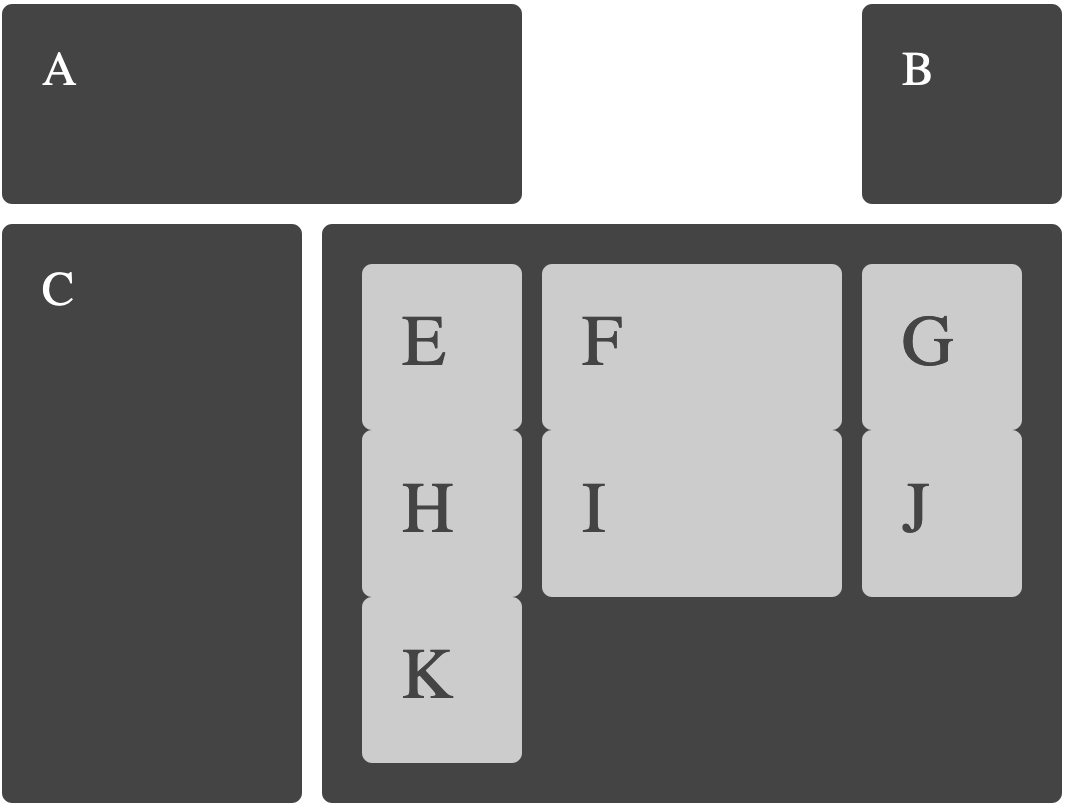
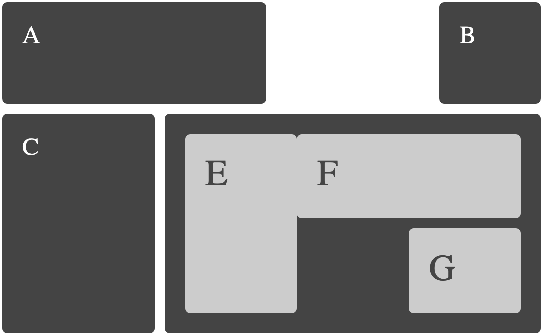
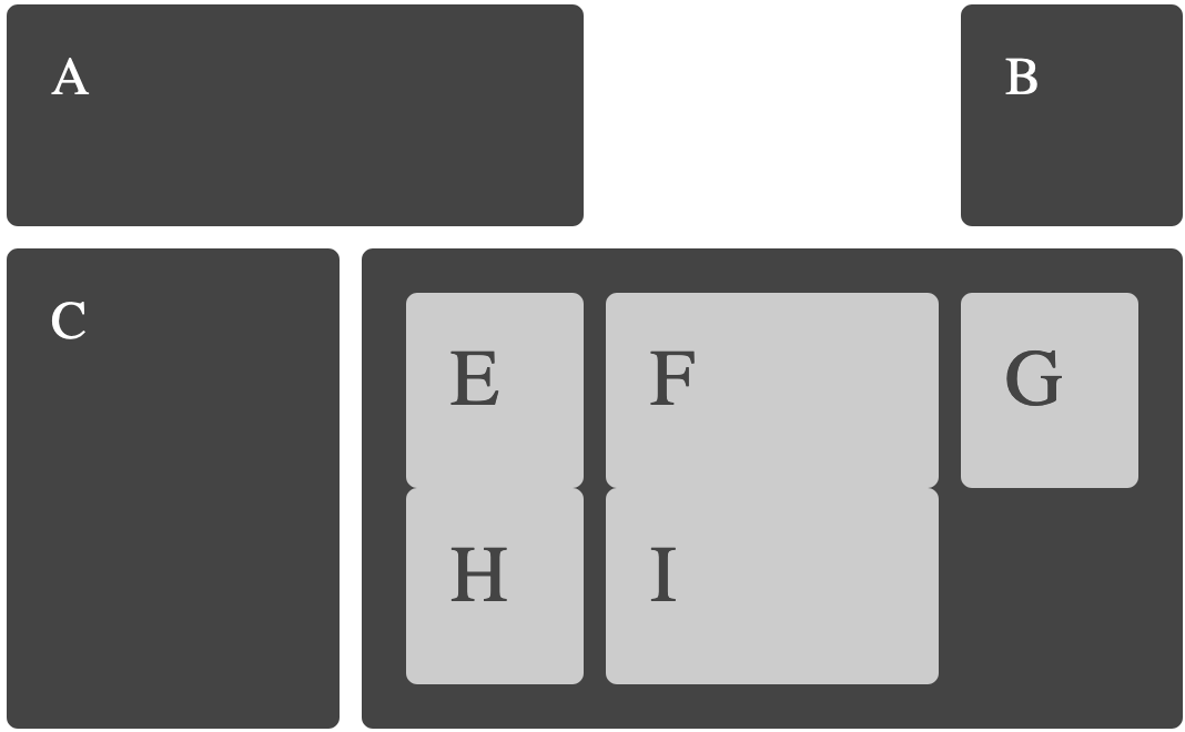
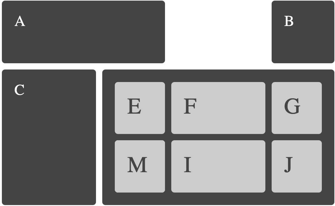
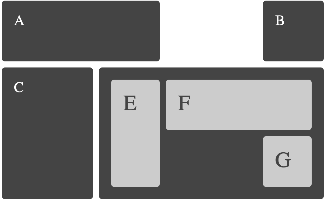
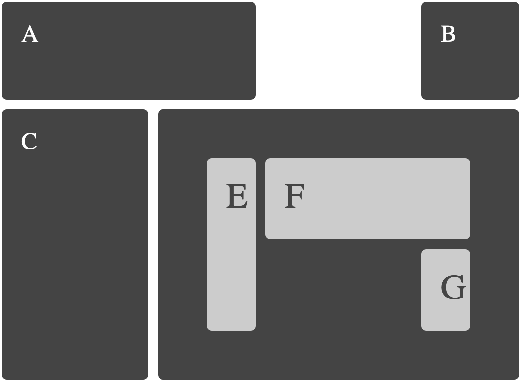
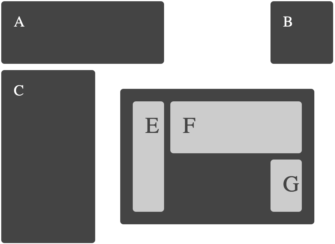
The following examples include an image of how the example should look in a supporting browser, they each link to a page with more information about the technique being shown, code and a CodePen of the example. Unless otherwise noted these examples work in any browser supporting the up to date Grid Specification. They will not work in IE10 or 11.
For page layout examples see a collection of page layouts here .
To define a grid use new values of the display property `grid` or `inline-grid`. You can then create column and row tracks.
Positioning items on the grid using line numbers
Positioning items on the grid using the shorthand properties.
Positioning items on the grid using the shorthand properties.
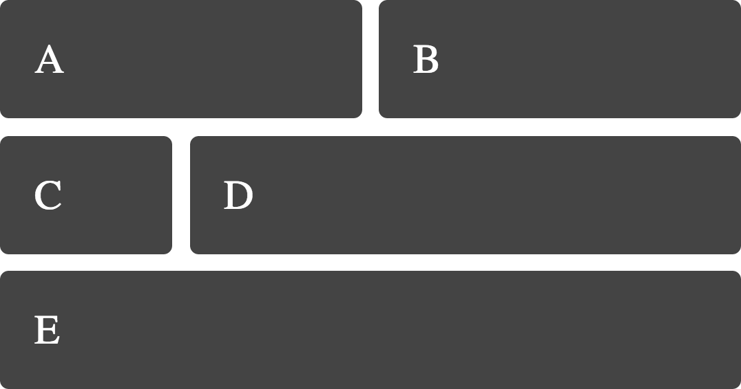
Positioning items which span more than one grid track.
The span keyword gives us a way to span tracks without needing to specify start and end lines.
In addition to using line numbers we can name lines.
You can give lines the same name and then use the span keyword to target lines of a certain name.
Save some time by describing repetitive track listings with repeat.
The explicit grid is defined by `grid-template-rows` and `grid-template-columns`.
We can create named areas on the grid to put content into.
Items sit in their own rows on the grid therefore we do not need to clear them as with floats.
As our layout is defined in CSS we can redefine the grid using media queries
Placement of items on the grid can be separate to their order in the source
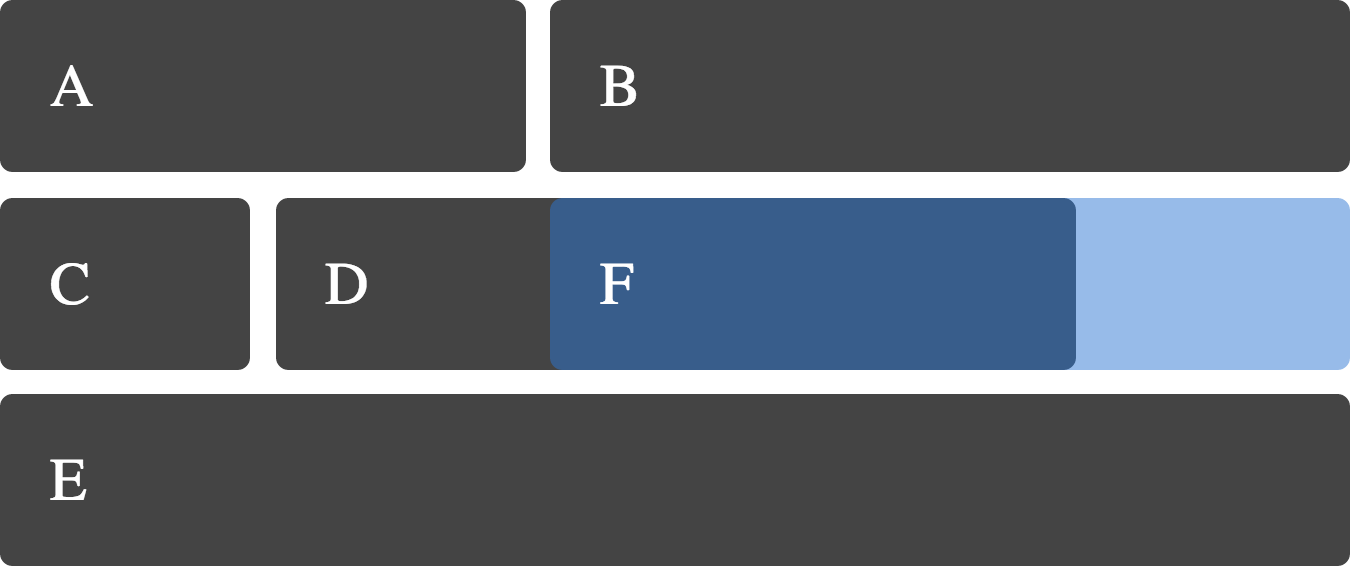
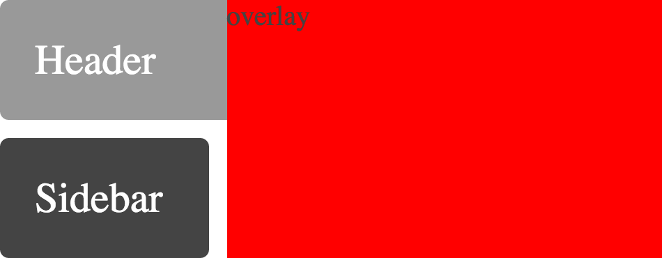
Items can be stacked, and the stacking order controlled with z-index
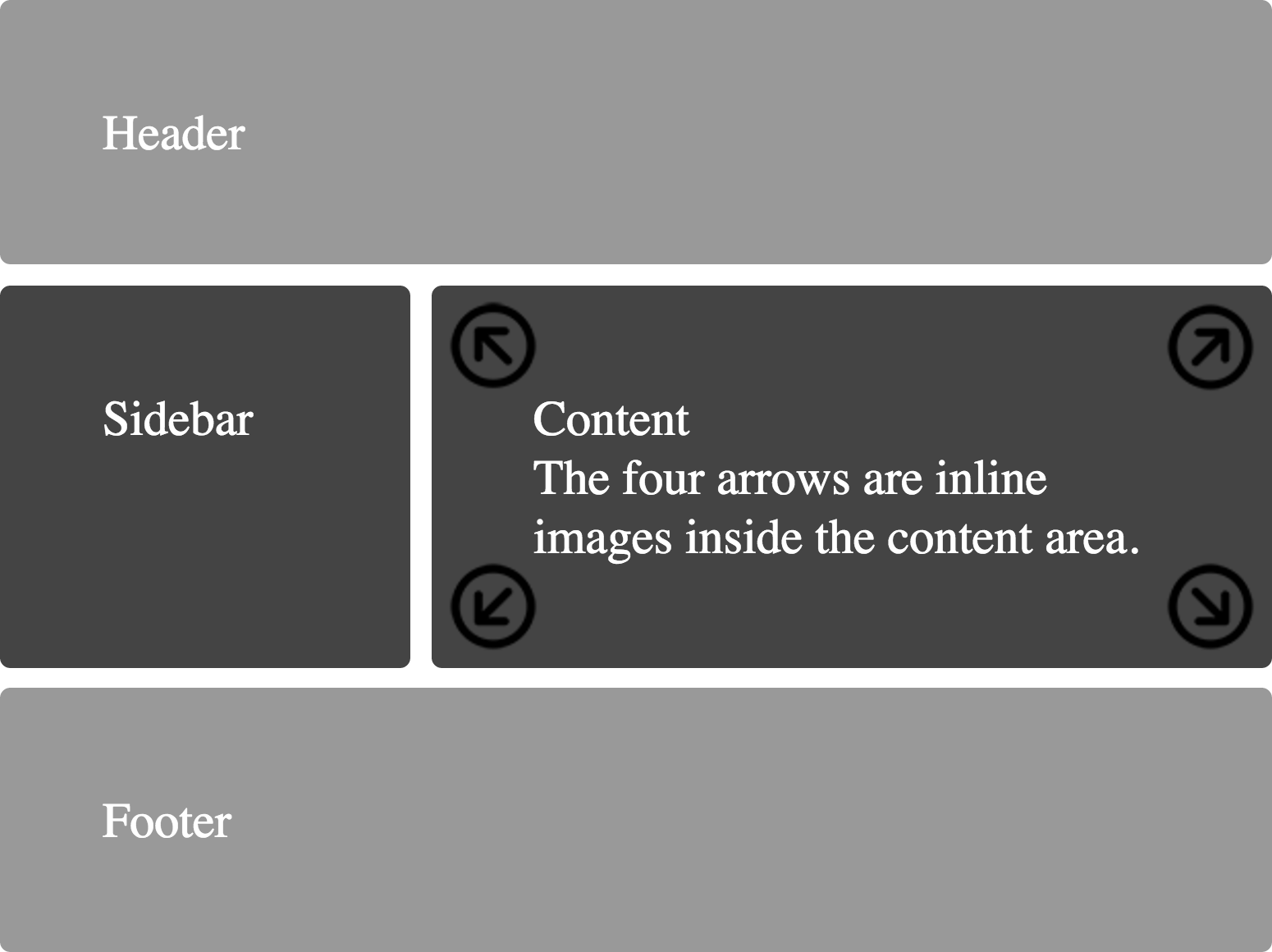
You can absolutely position items inside an area of the Grid.
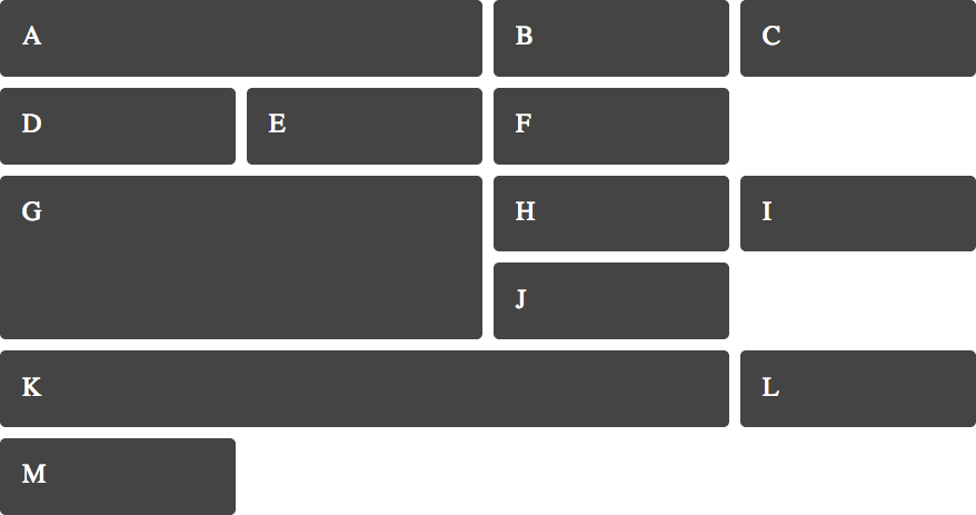
Grid will position grid items automatically on a grid created on the parent.
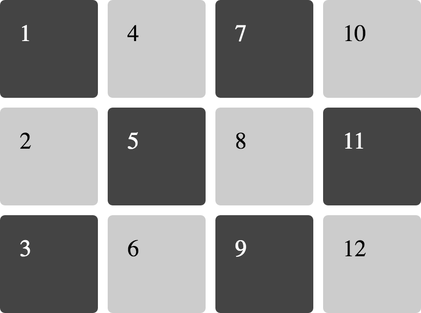
Items are placed in rows by default but you can specify to layout by column.
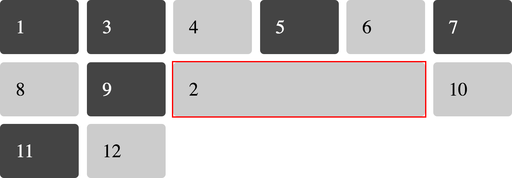
You can mix auto-placed items with those you give a position to
When using repeat notation you can use auto-fill rather than an integer to create as many tracks as will fill the container
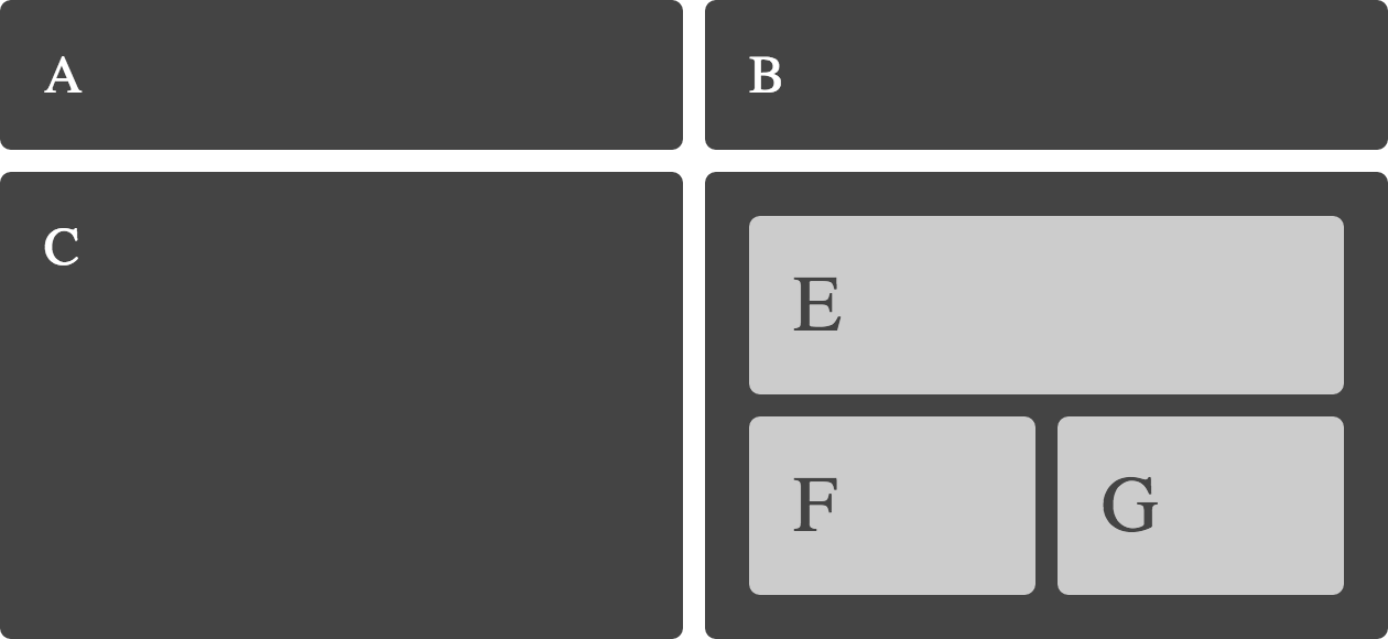
A grid item may become a grid container itself.
When using Named Areas implicit named lines are automatically created.
Grid supports the order property also found in Flexbox.
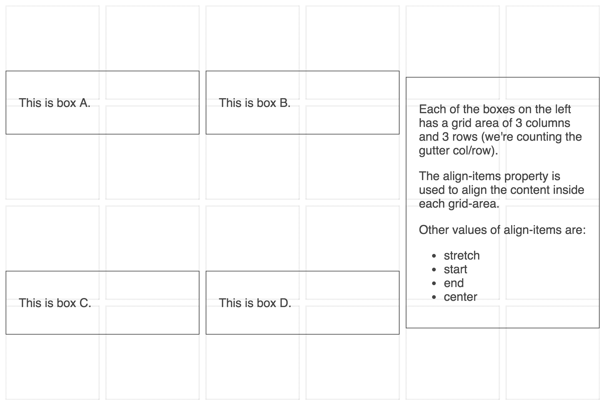
Using the box alignment property align-items
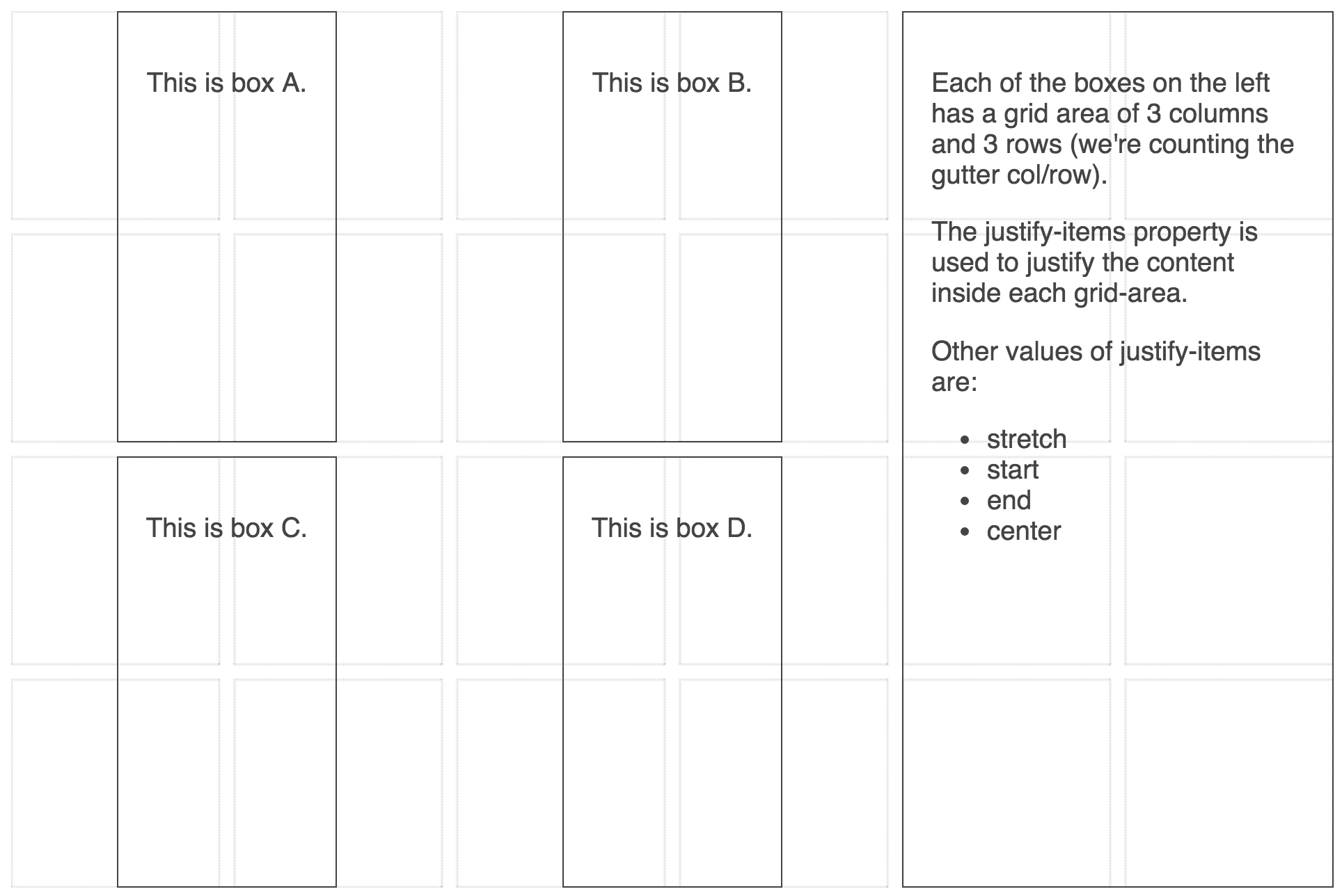
Using the box alignment property justify-items
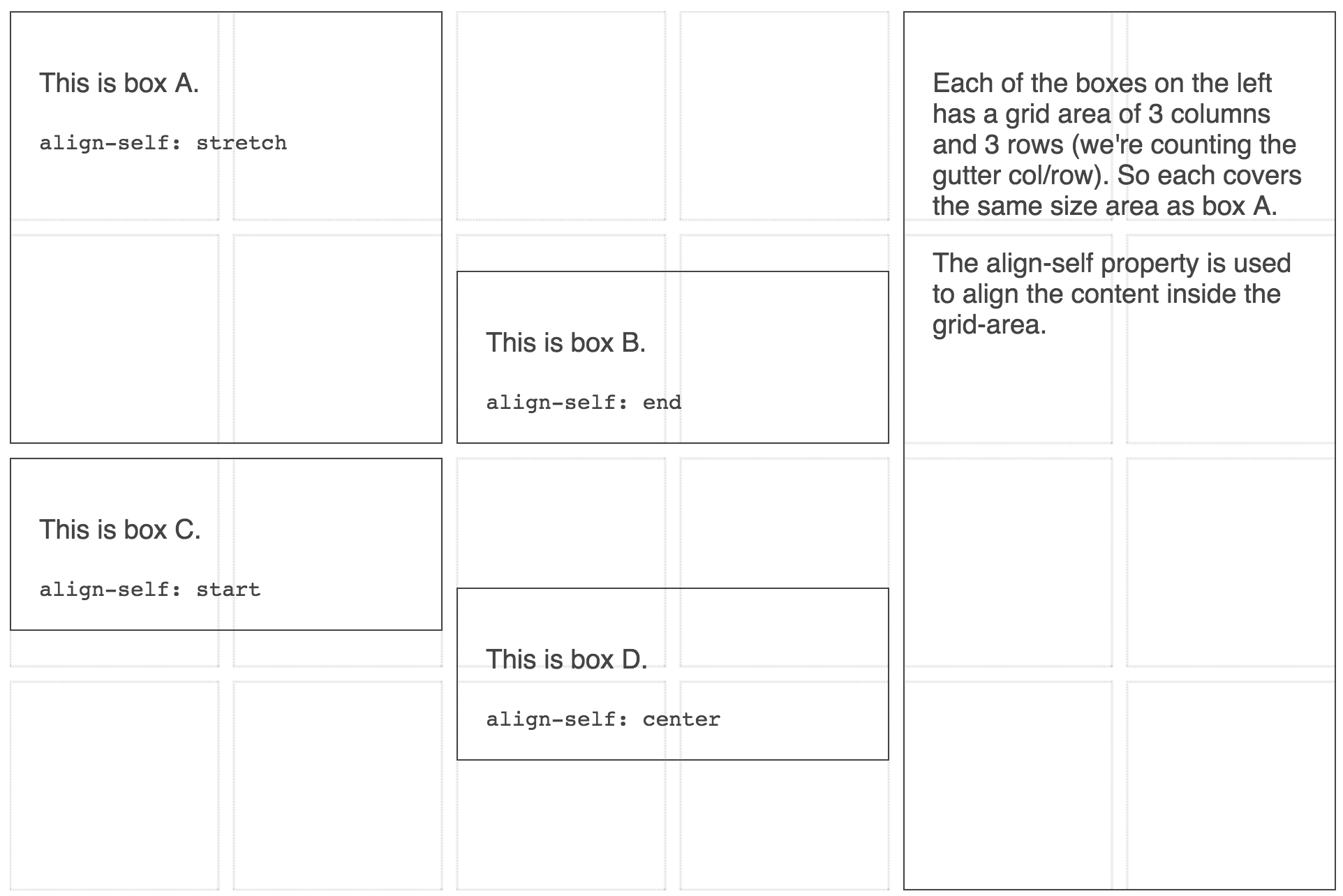
Using the box alignment property align-self
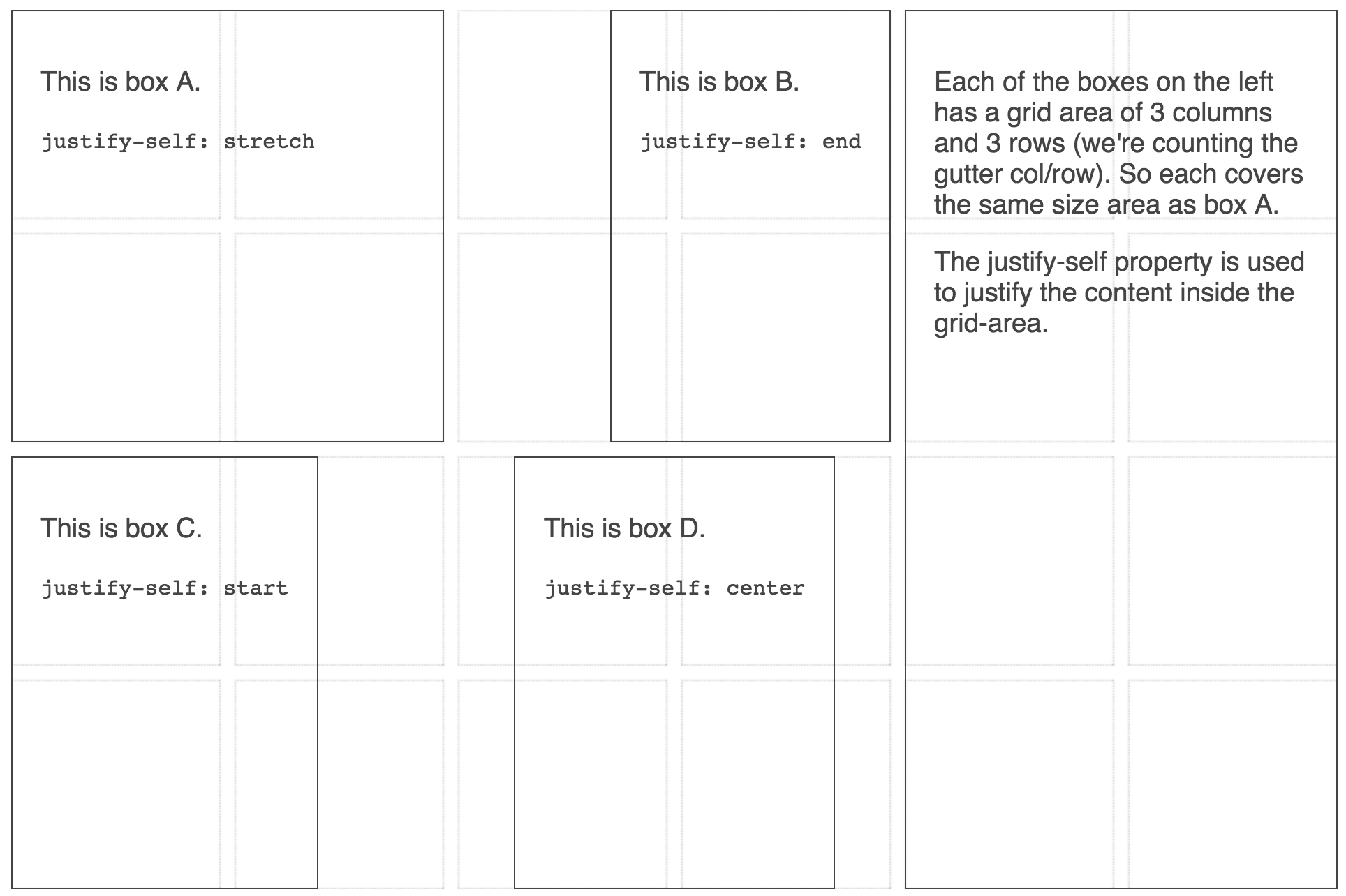
Using the box alignment property justify-self
A grid that contains as many 200 pixel column tracks as will fit into the container with the remaining space shared equally between the columns.
A grid that contains as many 200 pixel column tracks as will fit into the container with the remaining space shared equally between the columns.
An auto-fill grid, positioning items using named lines and span.
Using minmax() to make the first column stretch after placing all three column tracks
The total size of the tracks is smaller than the size of the grid container.
Using space-around and space-between may make grid areas and gutters larger than anticipated.
The repeat syntax can take a track-list rather than a single value.
Using minmax() to create tracks that grow proportionally with multiple track listings.
You can create grids using percentage values for tracks and gaps.
An example to demonstrate the difference between the auto-fill and auto-fit keywords in repeat notation
