What is CSS Grid Layout?
CSS Grid Layout is a CSS layout method designed for the two-dimensional layout of items on a webpage or application. I have been working with the specification over the last five years. On this site is a growing collection of example code, video tutorials and other resources to help you learn the specification.
Status of the spec and browser support
Chrome, Firefox and Safari shipped grid support in March 2017. Edge shipped support in October 2017. IE10, 11 and Edge 15 and lower support an older, prefixed spec. See Can I Use, and also the browsers page on this site which details where to log bugs should you find any.
Level 2 of the specification
Almost as soon as grid shipped in production browsers work began on level 2 of the spec. This contains the subgrid feature moved out of level 1 in order to allow implementations to ship. As I write (January 2019) there are no current implementations of the subgrid feature. You can read about how it should work in my post on Smashing Magazine - CSS Grid Level 2: Here Comes Subgrid.
Basic Concepts
Grid Layout gives us a method of creating grid structures that are described in CSS and not in HTML. It helps us to create layouts that can be redefined using Media Queries and adapt to different contexts.
Grid Layout lets us properly separate the order of elements in the source from their visual presentation. As a designer this means you are free to change the location of page elements as is best for your layout at different breakpoints and not need to compromise a sensible structured document for your responsive design.
It’s very easy to make grid adapt to the available space. With each element having an area on the grid, things are not in risk of overlapping due to text size change, more content than expected or small viewports.
Unlike with an HTML table-based layout, you can layer items on the grid. So one item can overlap another if required.
Grid or Flexbox?
One of the most common questions I get when talking about Grid is about whether this is a competing specification to Flexbox, and when should you use one or the other (assuming that there was browser support equally for both). I usually defer to this email from Tab Atkins on the www-style list.
Flexbox is for one-dimensional layouts - anything that needs to be laid out in a straight line (or in a broken line, which would be a single straight line if they were joined back together). Grid is for two-dimensional layouts. It can be used as a low-powered flexbox substitute (we’re trying to make sure that a single-column/row grid acts very similar to a flexbox), but that’s not using its full power.
If you only need to define a layout as a row or a column, and you would like the flexibility to respond to the content of that row then you probably want flexbox. If you want to define a grid and fit content into it in two dimensions - you need grid.
Grid Terminology
There are a few bits of terminology that are introduced by the Grid Layout specification. I’ve explained them here as they will make the examples easier to follow.
Grid Lines
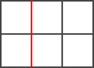
Grid Lines are the lines that make up the grid. These can be horizontal or vertical. We can refer to them by number, or by name.
Grid Tracks
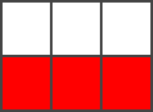
A Grid Track is the space between two Grid Lines, either horizontal or vertical.
Grid Cell
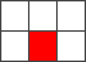
A Grid Cell is the space between 4 Grid Lines. So it is the smallest unit on our grid that is available for us to place an item into. Conceptually it is just like a table cell.
Grid Area
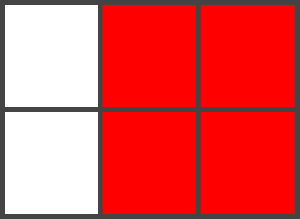
A Grid Area is any area on the Grid bound by four grid lines. It may contain a number of Grid Cells.