In this example this text block is given a position on the grid. At the 460 pixel breakpoint it goes into the first row spanning both columns. At 660 pixels it spans 2 rows and goes into the second column, spanning two columns.
The other items are display according to the grid auto placement algorithm, with grid-auto-flow set to dense.
At the 660 pixel breakpoint I set two of the images to span 2 columns. These wide images mean that if we set grid-auto-flow to sparse there would be a gap where the image 'balloons 5' sits as it would be displayed in source order after the wider 'balloons 4' image which needs to drop down to the next row to have room.
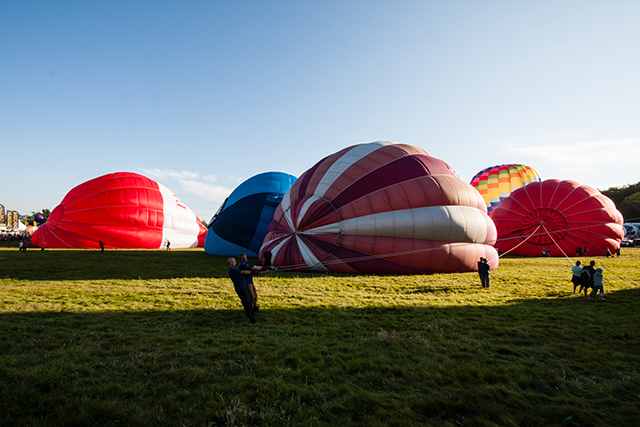
Balloons 1
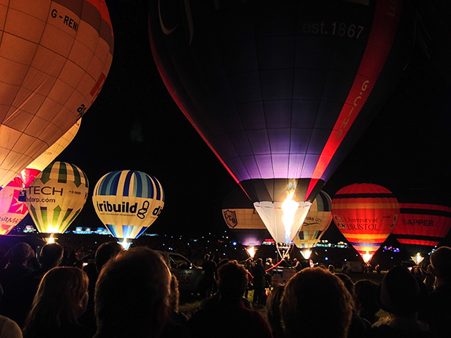
Balloons 2
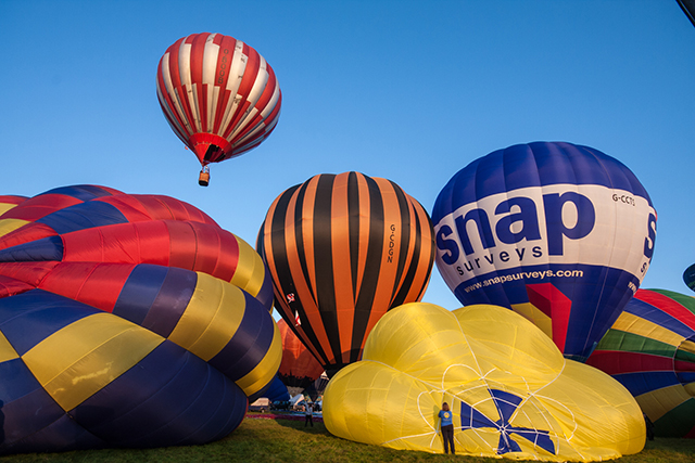
Balloons 3
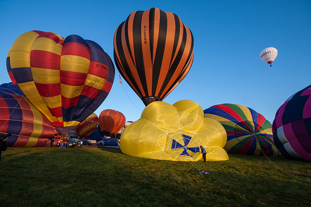
Balloons 4
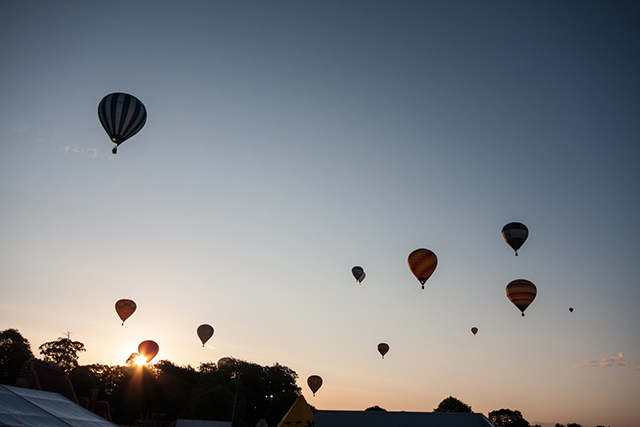
Balloons 5
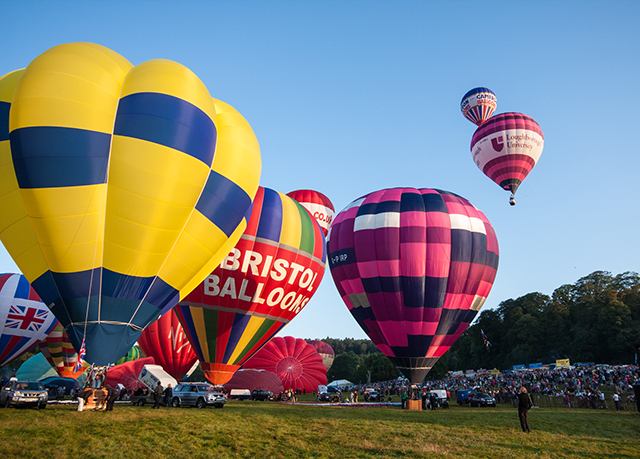
Balloons 6
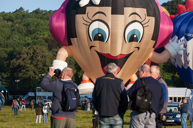
Balloons 7
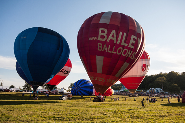
Balloons 8